Black Buffalo 3D
Project Skills & Roles
The Client
Black Buffalo 3D is a global provider of 3D construction printers and proprietary cement-based ink. The company is a US affiliate and member of the HN family of companies, formerly known as HYUNDAI BS&C Co. Black Buffalo 3D Corporation (“BB3D”) is the PA-based subsidiary of Big Sun Holdings Group, Inc.
The company has locations in Pennsylvania, New Jersey, and New York. BB3D is poised to revolutionize the construction industry and become the leading global provider of 3D construction printers (3DCP) from one to three stories, proprietary construction “ink” (Planitop™ 3D), and 3D print construction consulting services.
NEXCON™ printers were subsequently launched in early 2022 and are now available for rent, and purchase globally.
Project Tools
The Project
Black Buffalo engaged us in May 2021 to conduct a comprehensive overhaul of their entire suite of marketing and front-facing collateral. BB3D specifically wanted us to create a corporate visual identity system for its brand, and then deploy that system consistently throughout its entire portfolio of marketing assets.
Besides needing to communicate their new initiatives, the site itself needed a complete rethink and makeover. An outdated design and overwhelming navigation and architecture left visitors confused, disoriented, and lacking a full picture of what Black Buffalo 3D did and the many benefits of 3D construction printing.
Both website visitors and internal stakeholders struggled to try to find product and industry information on the site, and the site contained a lot of outdated content, resulting in broken links and bad SEO.
Our primary point of contact was the Company’s Chief Marketing Officer, Peter Cooperman, but we worked collaboratively with the entire C-suite as required.
We were tasked to initially focus our efforts on an agile and phased process that involved conceiving, conceptualizing, designing, developing, and implementing an entire suite of marketing collateral, each with its own set of unique and distinct specifications and requirements.
The Hire
Our existing website was outdated and generic. It reflected a startup with broad ambitions but didn't reflect the company's growth or current direction. It was difficult to navigate, not mobile-friendly, and was not providing enough information about our products, services, or inherent benefits that they brought to the construction industry. Ronny helped with all facets of content, design, and implementation of our new site resulting in lower bounce rates and higher lead capture.
Once the messaging was defined and the design was set, Meta.Lraft.Labs helped us create consistency across digital, web, and print materials. It's rare to find a firm that can cover so many areas of marketing and it made rebranding a straightforward and seamless process.
While evaluating marketing firms, Ronny's resume stood out. Ironically, he had partnered with a company where my former boss worked. A quick phone call confirmed that Ronny was incredibly capable and talented. I was given additional examples of Ronny's work from my contact that may not have been shared due to an NDA. It was clear that he was going to become a great asset to our business.
Peter Cooperman
Chief Marketing Officer
The Problem
average
monthly
users
average
bounce
rate
average
monthly
page views
leads in
HubSpot
CRM
The Results
increase
in total
page views
increase
in session
duration
increase
in total
sessions
increase
in HubSpot
leads
increase
in total
users
increase
in page views per session
decrease
in bounce
rate
increase
in global
views
The Deliverables

Corporate Slide Deck
Re-imagine the messaging, design, layout, and data visualizations for Company slide presentations with iterations for investors, partners, and customers.

Company Website
Design and develop a fully responsive, SEO-friendly, lead-generating website, built within a scalable and easy-to-use CMS and integrated with HubSpot CRM

Product Brochures
Create in-depth product brochure for NEXCON™ 1G and UG models in digital and print ready formats

Trade Show Exhibit
Design and create banners, arches, tables, and signage for 10,000 square outdoor exhibit booth

Corporate Apparel
Design and create branded apparel and promotional giveaways; t-shirts, jackets, sweatshirts, hats, and polos shirts

Corporate Publications
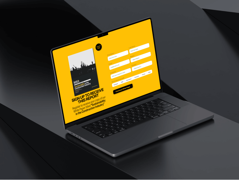
Create/design templates and layouts for white papers and case study reports in digital and print formats
The Process
Objectives and
Goals
Research and discovery
Stakeholder interviews
Review existing materials
Competitive analysis
Customer research
Research and
Define
Questions from interview
Client objectives
Project limitations
Build user personas
Define roadmap
Ideate and
Conceptualize
Information architecture
Content writing
Define asset list
Define tech protocols
Build wireframes
Design and
Iterate
Build master slide deck
Finalize design system
Design Figma templates
Map tech integrations
High fidelity mockups
Develop and
Implement
Setup hosting
Custom WordPress install
Build page templates
Build page sections
Integrate HubSpot
Integrate site analytics
Test and
Optimize
Browser testing
Device testing
Speed optimization
Form testing
HubSpot testing
Notification testing
Launch and
Monitor
Monitor website metrics
Monitor campaign metrics
Monitor SEO metrics
Optimize SEO content
Establish backlinks
Update and
Improve
Ongoing Quality Assurance
Monitor user feedback
PPC campaigns
Earned media campaigns
Post-launch monitoring
1.0 Discovery
During the discovery process, we took the time to fully understand BB3D’s business goals and target audience.
We conducted thorough market research and analyzed data from the company’s existing website, brochures, and slide deck to better familiarize ourselves with the Company’s products and industry competitors.
We also held stakeholder interviews with key members of the Company’s team to gather insights and gain a better understanding of their vision for the website redesign.
This information was then used to develop a comprehensive strategy for the redesign, including a detailed outline of the design and development process.
The discovery process allowed us to get a complete understanding of the challenges that BB3D was facing and deeper insight into its corporate and marketing objectives. This enabled us to tailor the redesign to meet their specific needs and goals.
The First Meeting
Ronny rocked the discovery meeting. He had done research on our businesses and impressed me with a wireframe up of what our website could be. It was visually appealing, well arranged and much easier to navigate than our existing site. His organization of relevant features, benefits and future vision was great. He also proactively spoke with several stakeholders to learn more about our business and generate a stronger “pain points” list that our offerings could address.
Peter Cooperman
Chief Marketing Officer
1.1 Define
Quantitative Objectives
increase website traffic
increase website page views
increase HubSpot MQL's
decrease bounce
rate
Brand Objectives
- improve brand equity and online reach by developing a new brand strategy and design language
- improve overall aesthetic and user experience to make the site more authentic and engaging
- increase brand awareness by showcasing the company’s products and brand messaging
- drive conversion of site visitors into contacts and ultimately customers
Technology Objectives
- implement fully responsive and mobile-friendly website solution
- implement user-friendly content management system (CMS)
- integrate all website lead forms with HubSpot CRM
- integrate SEO foundations to increase search engine traffic
- integrate social media channel feeds and links
- integrate 3rd-party hosted videos (YouTube/Vimeo)
- integrate PDF flipbook display of brochures and literature
- integrate Google Analytics for traffic monitoring
1.2. Challenges & Constraints
- The entire messaging strategy needed to be rethought
- New content would need to be created
- No alternative color palette would be considered
- Very limited production-ready photography of core product
- Supporting graphics or illustrations would need to be created from scratch
1.3 Research and Define
Before we started delving into the Black Buffalo message, we performed a brief competitive overview so that we could gain some perspective about where BB3D fits into the mix.
The 3D construction printing industry is a rapidly growing sector that is seeing a large number of companies competing against each other to establish themselves as the market leader.
These companies are focused on developing new and innovative technologies that can make the process of 3D printing buildings and structures more efficient, cost-effective, and scalable.
From large, established players with a proven track record to smaller, up-and-coming companies with innovative solutions, the competition in this space is intense as companies strive to differentiate themselves and capture a larger share of the growing 3D construction printing market. With the technology continuing to evolve and new players entering the market all the time, the competition in the 3D construction printing industry is only set to become even more intense in the years to come.
All competitive information represented herein is solely the opinions of MetaKraftLabs, LLC, and does not represent the opinions of Black Buffalo 3D, its affiliates, subsidiaries, or its employees. The information contained in this brief competitive analysis is represented to the best of our knowledge at the time of publication and solely based upon publicly available sources which we may not have been able to independently validate and verify. Competitor information may change without our knowledge at any time and may not be accurately represented herein.
1.4. User Personas
Our user personas will continue to be an important tool throughout the development process, guiding our design choices and helping us to create content and marketing collateral that truly meets the needs of all stakeholders in the construction industry.
This process allowed us to make sure that all of the informational needs of each distinct persona were being addressed during the content creation phase of the project.

Needs:
Differentiate from other contractors. Adaptation of new technology to grow business with repeatable projects.
Pain Points:
Labor prices increasing and supply chains create challenges. Reduce supply chain risk and maximize contractor output
Informational Needs:
Building code standards, operating costs benefit, transportability

Needs:
Differentiate from other contractors. Adaptation of new technology to grow business with repeatable projects.
Pain Points:
Aging labor force, lack of interest from younger generation, insufficient availability of workers to fill a multitude of jobs openings.
Informational Needs:
Machine durability, material science, project efficiency, labor cost savings

Needs:
On demand technology to facilitate and implement temporary crisis-housing solutions and barrack housing.
Pain Points:
Logistics, budget cycles, congressional oversight, spend cycles, budget overruns, inept contractors and processes.
Informational Needs:
Sustainability, construction speed, cost/benefit, distaster recovery, mobility
2.0 Conceptualize & Ideate
During the ideation phase, our team used a range of tools and techniques to generate new ideas, including brainstorming sessions, sketching, wireframing, and prototyping. We also held regular check-ins with BB3D to ensure that the concepts we were developing aligned with their vision and met their needs. This phase was an iterative process, and we continued to refine and improve the design concepts until we arrived at a solution that met all of the project’s objectives.
The ideation phase was a critical stage in the redesign process, as it allowed us to test and validate our ideas and develop a design that would deliver the best possible results for BB3D and its customers.

2.1. Typography
Aktiv Grotesk and Aktiv Grotesk Condensed lined up perfectly with those requirements.
Aktiv Grotesk is a sans-serif font that is known for its clean, simple, and modern look. It was designed by Dalton Maag and released in 2010. The font has a uniform stroke width and is characterized by its sharp corners and minimal curves.
Aktiv Grotesk Condensed is a variation of the Aktiv Grotesk font family that offers a more compact option for situations where space is limited. Like its parent font, Aktiv Grotesk Condensed features clean, geometric shapes and sharp corners that give it a minimalist and modern look. The condensed version of the font is narrower than the standard version, with tighter letter spacing and reduced line spacing, making it ideal for use in situations where space is at a premium, such as headlines, captions, or packaging.
We selected this font family due to its clean, modern aesthetic and versatility. With their wide range of weights and styles, Aktiv Grotesk and Aktiv Grotesk Condensed are both versatile options that are adaptable to different design contexts (branding, print, and web design). The condensed versions of the font also provide a more compact option when space is limited.

2.2 Color Scheme
| Primary #FFC004 |
◯ | |
| R 255 G 192 B 4 |
Lemon Chrome
| Gray #2E323A |
◯ | |
| R 0 G 122 B 255 |
Moonlight Gray
| Green #6c9676 |
◯ | |
| R 108 G 150 B 118 |
Woodley Sage
| Black #000000 |
◯ | |
| R 0 G 0 B 0 |
Pitch Black
2.3 Select Iconography
Several studies have shown that most people see, process, and remember images faster than words. Thus, the design enhances the user experience by properly supporting text with graphics. Additionally, consistent graphic elements used across site pages help define the integrity and clarity of the entire digital experience.
With this goal in mind, we created a variety of flexible custom icons for different web design and marketing purposes.
2.4 The Deck
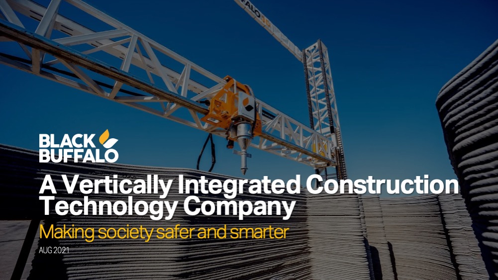
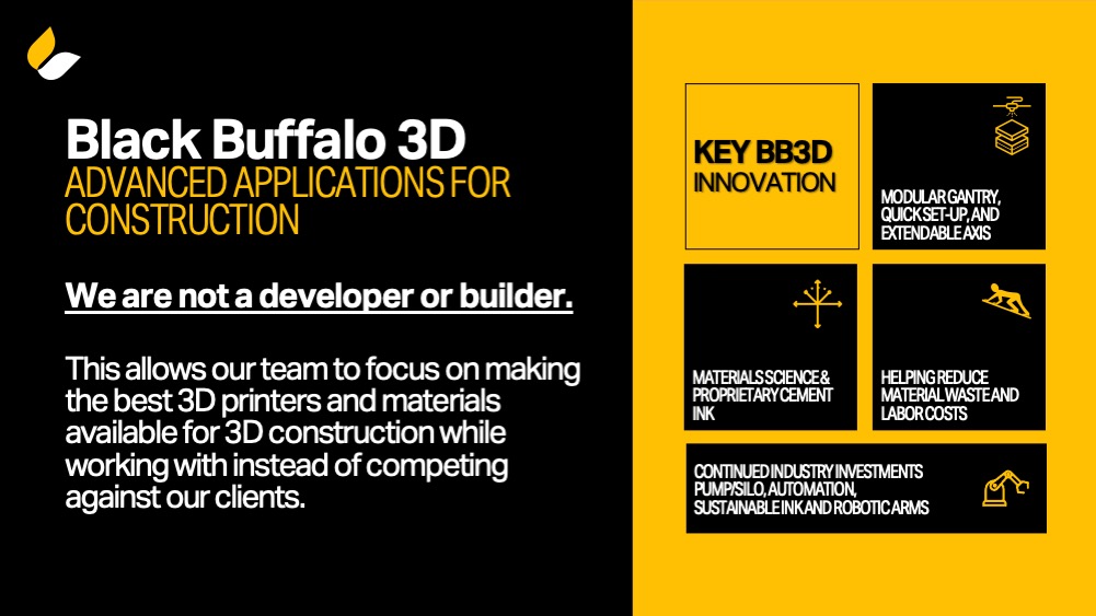
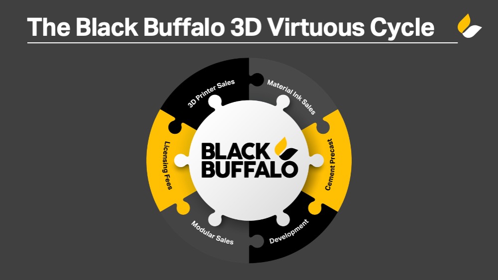
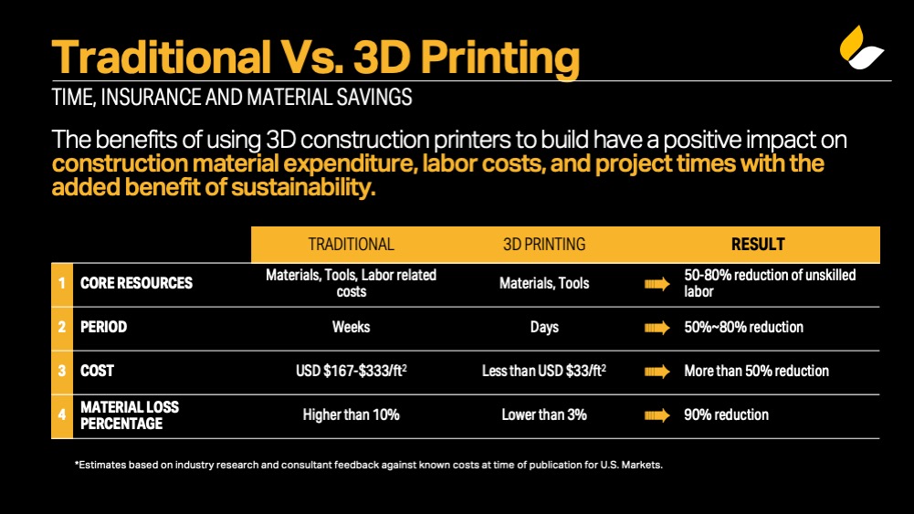
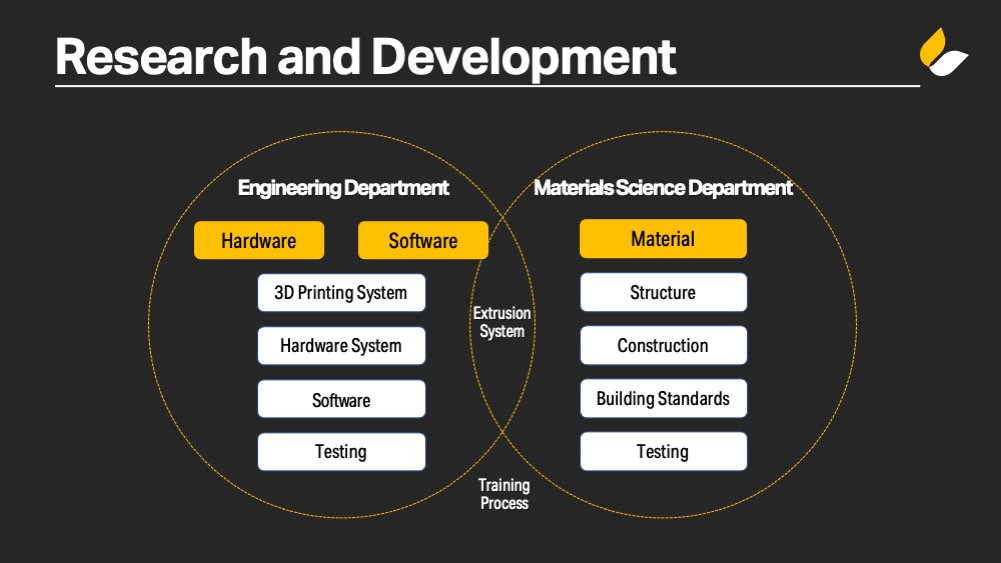
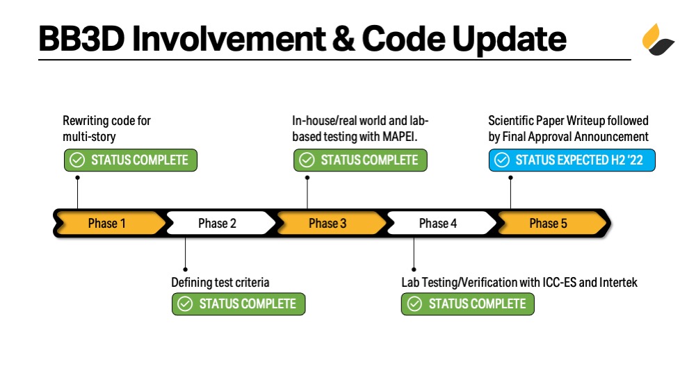
We’re firm believers in using presentation slides as an efficient tool to organize ideas, messaging, graphical styles, and short-form concepts. Creating a slide deck before designing a website can bring numerous benefits and value to the overall web design process.
The deck was hosted on Microsoft Office 365 and comments were collaboratively shared, discussed, and implemented. The slide deck was a great online tool that acted as a visual representation of the website’s structure and content.
This helped to clarify the goals, objectives, and messaging of the website as it was taking form, with each slide representing a section of content. The online slide deck was used to communicate the early stages of the website’s design to stakeholders and was used to solicit feedback, allowing for changes to be made early in the design process.
These slides provided a roadmap for the design process, content needs, and content flow, and ensured that everyone involved had a clear understanding of the website’s content structure, intended functionality, and user experience.












2.5 UX Strategy
The first thing we focused on was creating a new and more efficient site map that simplified access to the valuable information visitors were looking for. At the same time we were laying out the site map, we were also defining the content strategy for the redesigned website. The content strategy was central to ensuring only up-to-date and relevant content would remain on the site and helped us identify content gaps that existed where new content would need to be created to fully tell the story of this innovative technology construction company.

After the site map and content strategy were in place, it was time to wireframe the structure of the site. Wireframing allowed us to lay out the priority of content on each page across the site, to ensure an optimal user journey. As a very collaborative process, wireframing gave the team at Black Buffalo 3D an accurate preview of how the new site was structured and allowed us to iterate rapidly together to create an ideal user flow.
3.0 Website Overview
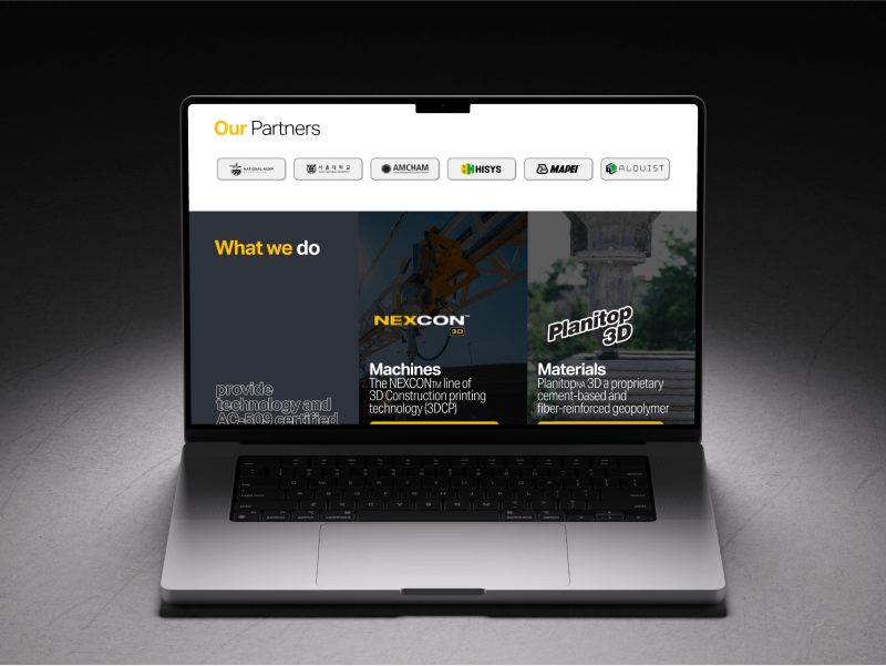
The website uses the sticky header to make the core navigational and social links available from any point of interaction. Great focus was placed on strategically constructing each section’s messaging so that the information featured is displayed into clear digestible blocks in which background color or imagery works as a visual divider.
3.1 The Wireframes
Wireframes are an essential component of the website design process. They provide a visual representation of the website’s layout, structure, and content without the distractions of colors, images, and typography. Wireframes serve as a blueprint for the website, allowing designers and stakeholders to focus on the website’s functionality and user experience. Below are the initial wireframes that were created for desktop and mobile devices.
3.2 Navigation
Navigation is one of the most important elements of a website. A well-designed navigation menu makes it easy for users to find the information they are looking for, and to get a sense of the overall structure of your website. To create an immersive experience, it is important to use a clear and consistent navigation menu that is easy to use and understand.
We implemented a header navigation that made use of “mega menus” for an easier user experience. A mega menu is a type of navigation menu that provides users with a more extensive and hierarchical view of a website’s content. Instead of a standard drop-down menu, mega menus display multiple columns of links, images, and text, allowing users to see a more comprehensive overview of the website’s content.

Light Navigation Header
Light Nav

Dark Navigation Header
Dark Nav

Light Navigation Header (Active)
Dark Nav (Active)

Mega Menu (3D Printing)
Mega Menu (3D Printing)

Mega Menu (Products)
Mega Menu (Products)

Mega Menu (Financing)
Mega Menu (Financing)
3.3 Hero Section
The hero section is the most prominent real estate on a web page and therefore should be the most visually appealing section of a site. It’s often the first element a visitor sees, it strongly influences initial impressions and often determines whether they will continue browsing or leave.
Our tried-and-true playbook for hero sections calls for 4 critical objectives:
- Grabs attention: A well-designed hero section with a strong headline and a visually compelling image or video can grab visitors’ attention and create a positive first impression.
- Communicates value proposition: A hero section is an opportunity to communicate the unique value proposition of a business, product, or service, and highlight the benefits that visitors will receive by engaging with it.
- Encourages engagement: A clear and prominent call-to-action (CTA) in the hero section can encourage visitors to take action, whether it’s signing up for a newsletter, scheduling a consultation, or making a purchase.
- Establishes brand identity: A hero section can also help establish the brand identity and personality of a business or organization through the use of visual elements, typography, and messaging.
3.4 The Home Page




3.5 Mobile & Responsive
In today’s digital age, having a mobile responsive website is no longer a luxury but a necessity. As more and more people are accessing the internet through their mobile devices, it’s essential to ensure that your website is optimized for mobile viewing.
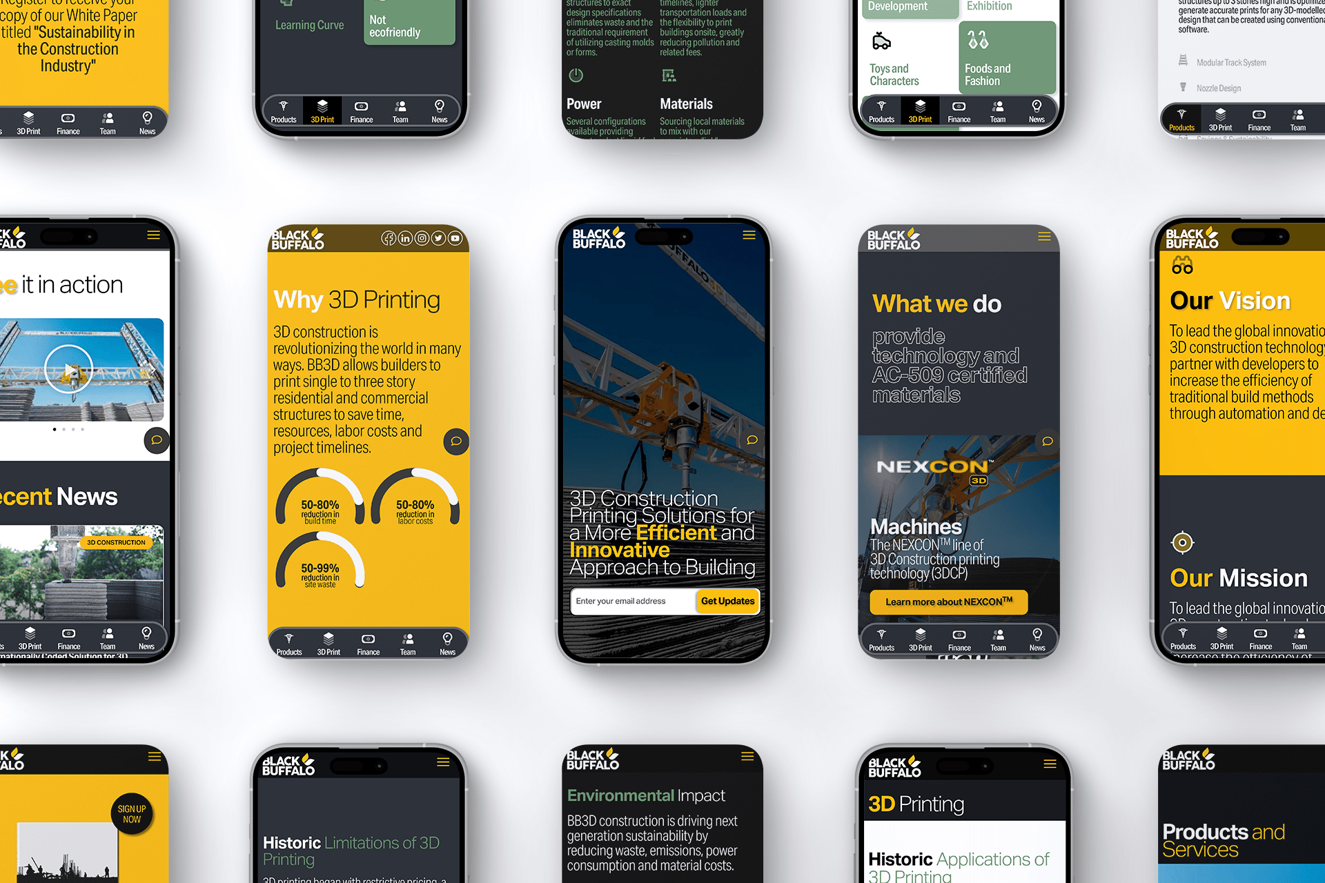
We re-imagined the BB3D mobile experience and focused on creating a user-friendly and visually appealing website that seamlessly adapts to different screen sizes and devices. The mobile responsive design for Black Buffalo 3D not only improved the website’s functionality but also significantly increased the client’s website traffic and user engagement.
To ensure a seamless user experience across all devices, operating systems, and browsers, we built a scalable visual design system for BB3D. This system included a set of design guidelines, components, and patterns that allowed us to create a consistent and cohesive look and feel throughout the website. By using a modular approach, we could easily adapt the design system to any device or screen size without compromising the visual integrity of the website.
Our team also took into consideration the different operating systems and browsers that users might use to access the website, ensuring that the website performs consistently across all platforms. By building a scalable visual design system, we were able to provide our client with a website that not only looks great on all devices but also functions seamlessly.


3.6 Custom Backend
MetaKraft360° is a highly customizable and flexible backend that enables BB3D to tailor their website to their specific needs. The backend’s features include a drag-and-drop page builder, customizable themes, and extensive plugin support. This flexibility allows BB3D to make changes to their website quickly and easily, without the need for extensive coding knowledge. The backend’s user interface is also highly intuitive and easy to use, with a focus on usability and accessibility. The interface is designed to make it easy for users to manage content, update plugins, and customize the website’s appearance without needing to navigate through complex menus or technical jargon.
3.7 Corporate Publications
Creating print-ready versions was a critical part of the design process, ensuring that the materials would be of high quality and ready for distribution to customers. This involved working closely with printers and graphic designers to ensure that the materials were designed according to industry standards and that the final product met the company’s requirements.
Digital versions of the materials were also developed to ensure that they could be easily accessed by customers and shared through various digital platforms. The digital versions featured interactive elements such as hyperlinks, videos, and animations that added an extra layer of engagement to the content.
Overall, the design and development of product brochures, white papers, and corporate publications were essential components of Black Buffalo 3D’s marketing strategy. These materials served as powerful tools to educate potential customers about the company’s products and services, while also establishing the brand’s credibility and expertise in the industry.
3.8 Trade Show Booth
Additionally, the booth was designed to be functional, with clearly defined areas for product displays, demonstrations, and interactions with visitors. The final product was a successful representation of Black Buffalo 3D’s brand and products at the trade show, attracting potential customers and generating new business opportunities.
In addition to the exhibition booth design, we also created roll-up banners to complement the booth’s design. The roll-up banners featured a strong visual impact with high-quality graphics and clear messaging that conveyed the company’s key products and services. The messaging was concise, direct, and focused on highlighting the unique value proposition of Black Buffalo 3D.
The importance of messaging cannot be overstated when it comes to designing a trade show exhibit booth. The messaging must be clear and easy to understand, catching the attention of visitors quickly and effectively. Potential customers will be walking through a crowded and busy environment with many other exhibitors competing for their attention. Therefore, it is essential to have a strong and compelling message that can cut through the noise and capture their interest.


